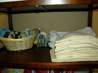
The stuff I did in Nathan's room wasn't THAT noticeable but it was huge to me. It was mainly his changing table area. It was growing cRaZy-cluttered and there were a few things within his reach that would have thrown me into "freak-out-mode" if he had gotten ahold of it. Though he doesn't usually play in his room (he keeps to the living room or wherever I am at) I wanted his room to be, well, HIS room! I wanted it to be safe for him. So, I covered the plug-ins in the wall. I moved his swing to the other side of the room (That is, until it gets stored in the garage. Waiting on the hubs for that). And then I reorganized his changing table area.
I moved all his burp cloths and bibs into a drawer in his dresser. I removed all the pins and q-tips and such from his reach and put them in a basket under the sink in the bathroom. Then I rearranged and organized his diapers and wipes. I'm pleased. Here are the pics:
Before:
After:
much better
Where his swing was, I made into a little play area.
P.S. That little piano was mine as a baby. :)
His dresser area
THEN I did something I've been wanting to do for MONTHS. When Grant and I married, we had painted the guest bathroom a dark grey/charcoal color. We were given a light purple shower curtain, so we just made everything light purple. It was pretty but, not something I absolutely loved. So I have spent the last two months debating on what to do. Should I paint the bathroom? Should I just change the decor? And then I tried to think of a way to make it kid-friendly and neutral for both boys and girls, AND have it "grown up" enough for our guests. The bathroom is right across the hall from Nathan's room, so I wanted it semi-fun and bright for him. But it's also the bathroom that friends and family use, so I didn't want it screaming "KID DOMAIN" either. I wanted to be frugal and wise and practical. So yesterday, after two months of thinking, I went to Wal-Mart and started browsing around. I was about to leave when a shower curtain caught my eye and I thought, "This would go well with the charcoal color of the wall. I wouldn't have to spend extra money on paint. AND it would compliment the general colors of our house, too." One savvy move, and $30 later - TA DA! I am very happy with how it turned out.
Before
After!
Nathan's toy bath basket
the sink area
A little here, a little there, and the whole look of the room is different. I love it. <---- happy mom.


2 comments:
As I said on Facebook -- I LOVE it!!! Great job!
Very cute! I love all the little changes that make such a big impact on a room! I really liked how you tried to make the space kid friendly but not kid dominated. Nice job! :)
Post a Comment